
You can create a website on iPhone using website builder apps such as Wix or WordPress. These apps offer user-friendly interfaces for designing websites directly from your iPhone.
In today’s digital age, having a strong online presence is crucial for businesses, bloggers, and individuals looking to showcase their work or connect with a wider audience. With the convenience of mobile devices, creating a website on your iPhone is now easier than ever.
Website builder apps provide templates, drag-and-drop features, and customization options to help you create a professional-looking site in just a few simple steps. Whether you are a small business owner, freelance artist, or aspiring writer, having a mobile-friendly website can help you reach your target audience and grow your online presence. This guide will walk you through the process of creating a website on your iPhone using popular website builder apps.
Choosing The Right Platform
When creating a website on an iPhone, choosing the right platform is crucial. Select a user-friendly website builder app that offers a wide range of templates and customization options. Ensure that the platform provides seamless integration with mobile devices for easy management and updates.
Choosing the Right Platform For creating a website on your iPhone, choosing the right platform is crucial. Here’s a brief guide to help you make an informed decision. Assessing Your Needs Before selecting a platform, assess your needs. Consider the purpose, design, and functionality of your website. Comparison of Available Platforms 1. WordPress: User-friendly with a wide range of themes and plugins. 2. Wix: Offers drag-and-drop tools for easy customization. 3. Squarespace: Known for its sleek templates and simplicity. 4. Weebly: Ideal for beginners with its intuitive interface. Evaluate each platform based on your requirements to make the best choice.
Credit: buildfire.com
Planning Your Website
Defining Your Goals
Before diving into creating a website on your iPhone, start by defining your goals. What purpose will your website serve? Who is your target audience?
Mapping Out Your Site Structure
Next step, map out your site structure. Organize your content logically to ensure easy navigation for visitors.
Designing On Mobile
Designing on mobile has become an essential aspect of creating a website, especially with the increasing use of smartphones and tablets. As more users access the internet through mobile devices, it is crucial to ensure that websites are not only functional but also visually appealing on smaller screens. In this section, we will explore the key considerations for optimizing your website design specifically for mobile devices.
Optimizing For Mobile
When designing a website on an iPhone, optimizing the layout and content for mobile viewing is paramount. Simplify navigation, prioritize key information, and ensure fast loading times to provide a seamless user experience.
Selecting Mobile-friendly Themes
Choosing a mobile-friendly theme is crucial for creating a website on an iPhone. Look for responsive designs that adapt to various screen sizes, ensuring your website looks great on all devices.

Credit: www.upwork.com
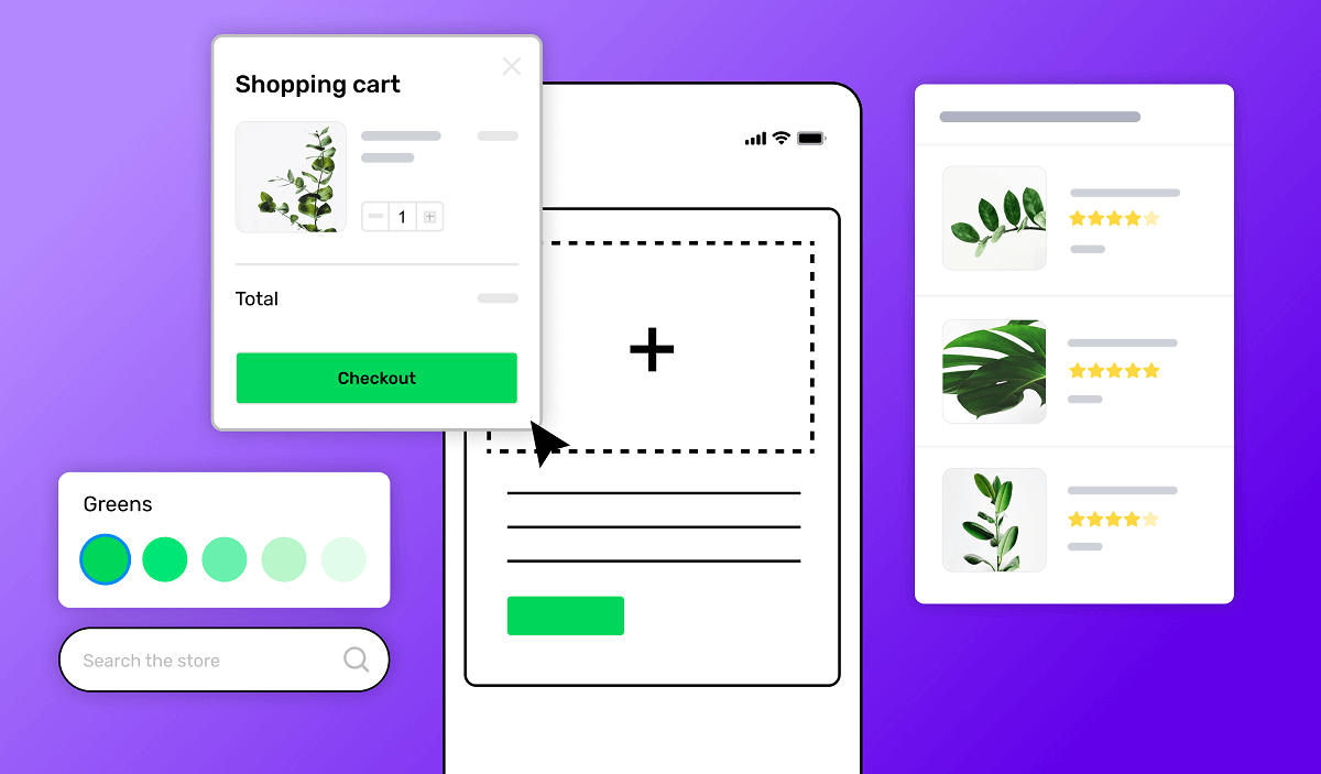
Content Creation And Management
Creating compelling content and effectively managing it on your website is essential for engaging users and driving traffic. With the convenience of an iPhone, you have the power to create and update your website’s content anytime, anywhere. In this section, we will explore how you can create captivating content and utilize mobile editing tools to make the process seamless.
Creating Compelling Content
When it comes to creating content for your website, quality and relevance should be your top priorities. Here are some tips to help you craft compelling content:
- Know your audience: Understand the needs and interests of your target audience. This will enable you to create content that resonates with them.
- Research keywords: Identify relevant keywords that your target audience is searching for. Including these keywords in your content will improve your website’s visibility in search engine results.
- Write engaging headlines: Captivating headlines can grab the attention of your audience and entice them to read more. Use action words and make sure your headline accurately represents the content.
- Create well-structured content: Break your content into small, easy-to-read paragraphs. Use headers, bullet points, and numbered lists to enhance readability. This makes it easier for users to scan and find the information they need.
- Include multimedia: Incorporating images, videos, and infographics can make your content visually appealing and hold the interest of your audience.
Utilizing Mobile Editing Tools
Managing your website’s content on your iPhone is made simple with the availability of mobile editing tools. These tools allow you to make updates and changes on the go. Here are a few mobile editing tools to consider:
| Tool | Features |
|---|---|
| WordPress App | – Create and edit posts and pages. |
| Squarespace App | – Manage content and design your website. |
| Wix Mobile App | – Create and edit pages using a drag-and-drop editor. |
These mobile editing tools offer intuitive interfaces, allowing you to make changes effortlessly. Whether you need to update a blog post, add new content, or make design modifications, you can do it all from your iPhone.
With the content creation and management tools available on your iPhone, you can maintain an engaging and up-to-date website that keeps your audience coming back for more. Make sure to create compelling content that meets the needs of your audience and utilize mobile editing tools for seamless website management.
Testing And Launching
After you have put in the hard work of designing and building your website on your iPhone, it’s time to take your creation to the next level by testing and launching it. This crucial step ensures that your website is functioning properly and optimized for mobile devices. In this section, we will explore two key aspects of testing and launching: mobile-friendly testing and launching your mobile-optimized site.
Mobile-friendly Testing
Once your website is designed and built on your iPhone, it’s important to ensure that it is mobile-friendly. Mobile-friendly websites are designed to provide a seamless browsing experience on smartphones and tablets. With an increasing number of users accessing the internet on their mobile devices, it is imperative that your website is optimized for these smaller screens.
There are several tools and techniques you can use to test the mobile-friendliness of your website. One effective method is to use Google’s Mobile-Friendly Test tool. Simply enter your website’s URL, and the tool will analyze your site and provide a detailed report on its mobile-friendliness. It will identify any issues or areas that need improvement, such as text size, tap targets, or viewport configuration.
In addition to using the Mobile-Friendly Test tool, it’s also a good idea to test your website on actual mobile devices. This will give you a firsthand experience of how your website appears and functions on different screen sizes and resolutions. Consider borrowing or using friends’ devices to ensure that your website is consistent and user-friendly across various mobile platforms.
Launching Your Mobile-optimized Site
Once you have tested and optimized your website for mobile devices, it’s time to launch it and make it accessible to the world. Before launching, make sure to consider the following steps:
- Domain and Hosting: Choose a reliable and secure hosting provider that offers fast loading speeds and 24/7 support. Select a domain name that is short, memorable, and relevant to your website’s content.
- Responsive Design: Ensure that your website has a responsive design, meaning it automatically adjusts its layout and content to fit different screen sizes. This ensures a consistent and user-friendly experience across all devices.
- SEO Optimization: Optimize your website for search engines by implementing relevant keywords, meta tags, and descriptive URLs. Create unique and engaging content that is valuable to your target audience.
- Mobile Indexing: Register your website with Google Search Console to ensure that it is mobile-friendly and can be easily indexed by search engines. This will improve your website’s visibility and organic ranking.
- Testing: Test your website thoroughly across different devices and browsers to ensure that it is fully functional and displays correctly. Check for any broken links, formatting issues, or slow loading times.
- Launch: Once you are confident that your website is mobile-optimized and ready to go, it’s time to launch! Promote your website through social media, email marketing, and other channels to drive traffic and increase your online presence.
By following these steps, you can ensure that your website is not only visually appealing but also functional and user-friendly on mobile devices. Testing and launching are crucial stages in the website development process, so take the time to thoroughly test and optimize your website before making it live. Once launched, regularly monitor and update your site to keep it relevant and engaging for your audience.
Credit: www.builder.ai
Frequently Asked Questions For How To Create A Website On Iphone
Can I Make A Website From My Iphone?
Yes, you can create a website from your iPhone using website builder apps like Wix, Squarespace, or WordPress Mobile.
Can I Make A Website From My Phone?
Yes, you can create a website from your phone using website builder apps. Simply choose a mobile-friendly platform, design, and publish your site conveniently.
How Do I Create My Own Website?
To create your own website, choose a domain name and hosting provider. Then, use a website builder or CMS like WordPress to design and customize your site. Add content, images, and optimize for SEO. Lastly, launch your website for the world to see.
How Do I Create A Quick Link To A Website On My Iphone?
To quickly create a link to a website on your iPhone, open Safari, visit the desired webpage, tap the share icon at the bottom of the screen, and choose “Add to Home Screen. ” This will create a shortcut icon on your iPhone’s home screen for easy access to the website.
Conclusion
In Conclusion, creating a website on your iPhone is achievable with the right tools and guidance. By utilizing mobile-friendly design, responsive themes, and handy website builders, you can easily bring your online presence to life. With these steps, you can enjoy the convenience of managing your website on the go.